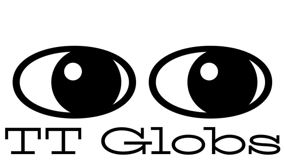
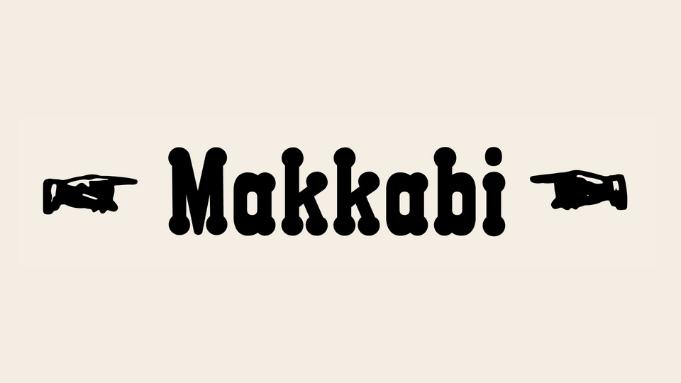
The idea to develop TT Globs was inspired by a combination of historical slabs and contemporary perceptions of fonts, their uses and display shapes of letters. We aimed to make the curves more mechanical and modular, contrasting with the cozy lines from historical specimens. As a result, TT Globs has long display serifs and narrow spacing, creating a unified text image with tall lowercase characters and long ascenders and descenders. The font also has asymmetric wave-like terminals and flowing elements in some letters, alternative letters with sticking serifs, a set of beautiful ligatures, and several original icons and frames. With 3 weights and one variable font, TT Globs is an interesting, modern font that can be used to create unique visuals.


)
)
)
)
)
)
)
)
)
)
)