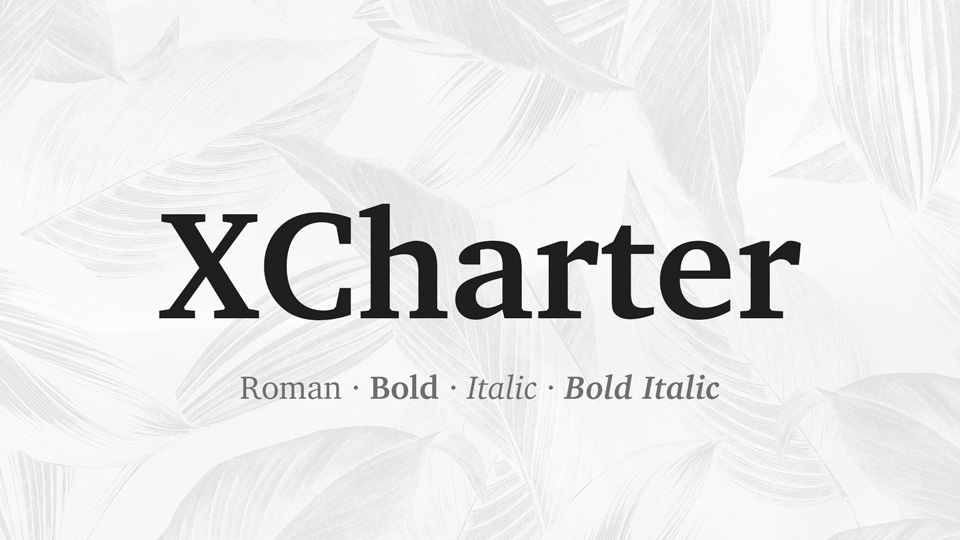
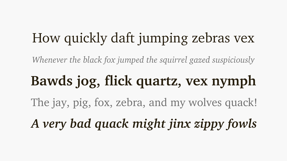
The XCharter font family is an extension of the classic serif typeface, offering a contemporary interpretation of the traditional style. Featuring sharp, angular serifs and a large x-height, XCharter is an ideal font for editorial, web and print design. Its versatile character and legibility make it a perfect choice for headlines, body text, and logos. The font family includes six weights, from light to black, as well as matching italics. With its modern take on a classic typeface, XCharter is a great choice for adding a sophisticated touch to any design. It's a timeless font that can be used for a variety of projects, from branding and advertising to editorial and web design. With its versatility, XCharter is a must-have for any designer's library.
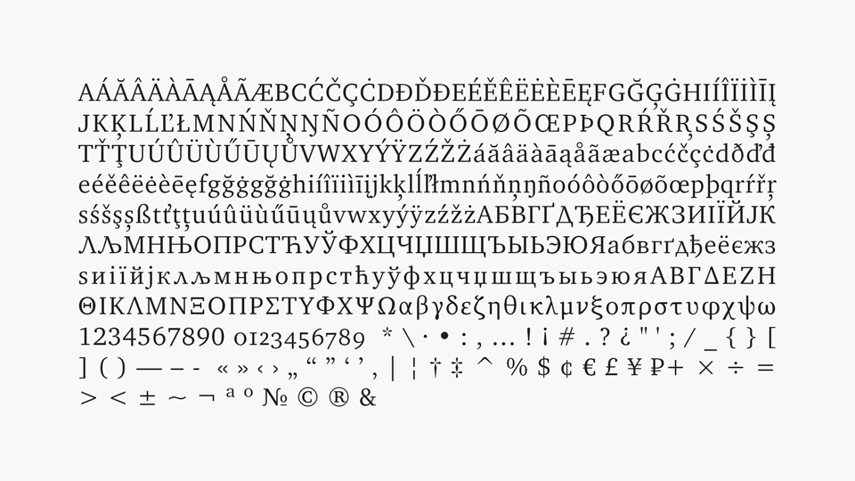
Charter fonts, adding oldstyle figures, superior figures and small caps in all styles. The original Charter fonts were created by famed font designer Matthew Carter in the late 1980’s to enhance legibility of the output from printers of that era (laser, dot matrix, thermal and inkjet) with resolutions that would now be considered low—not far from modern screen resolutions. Their low contrasts, high x-heights and use of piecewise linear outlines where possible may make them interesting again as fonts that will render well on small devices and perhaps projected slides.
There is a new collection of Cyrillic glyphs in XCharter, copied from Andrey Panov’s Khartiya, an extension of the free Charter fonts, with small caps included. Some new figure styles were also copied from Khartiya—inferiors, numerators and denominators. Along with these additions, there are now slanted versions for those who wish to have both slanted and italic text available to meet distinct semantic purposes.
)
)
)
)
)
)
)
)
)
)
)