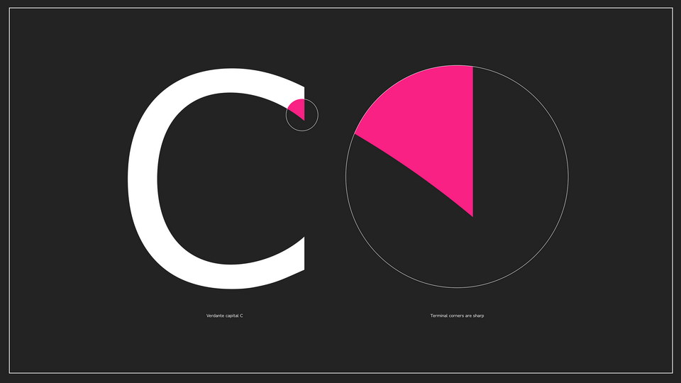
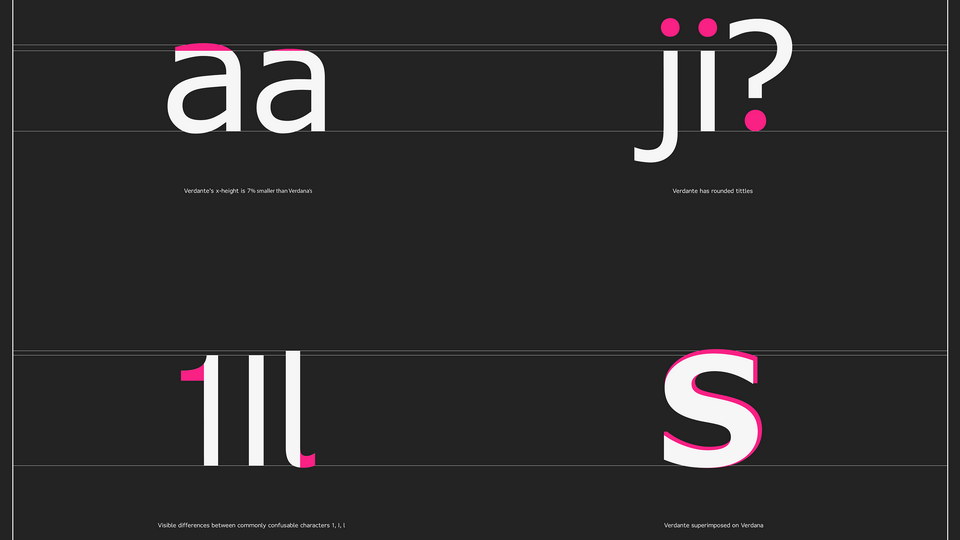
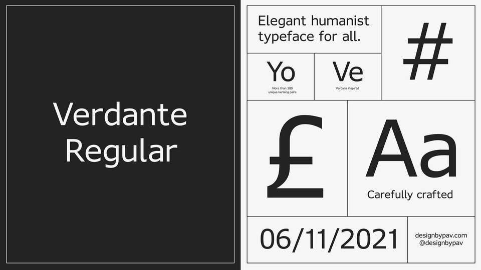
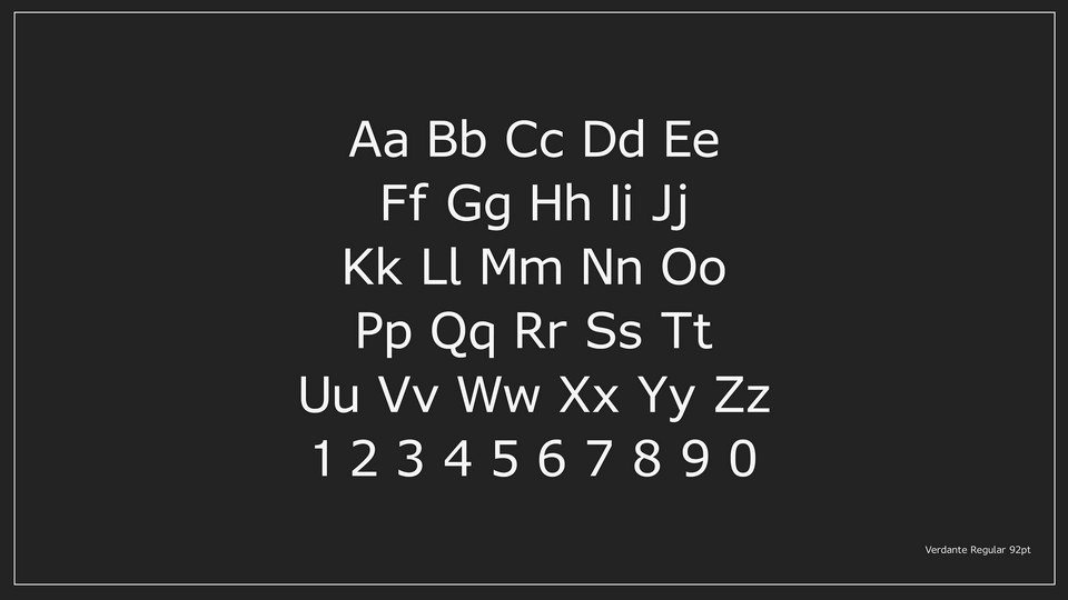
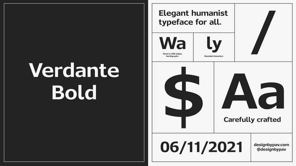
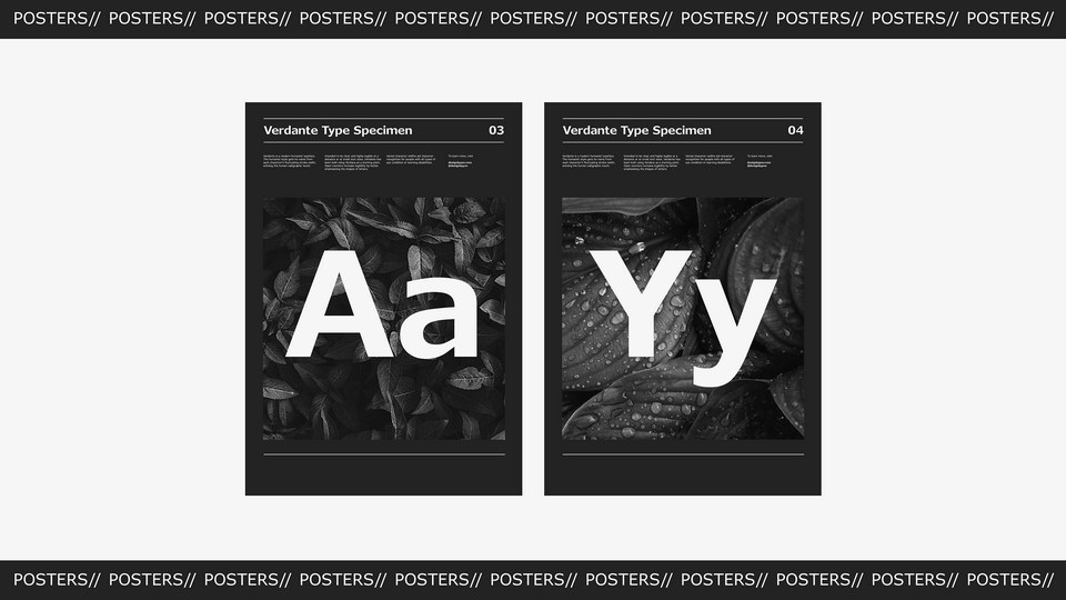
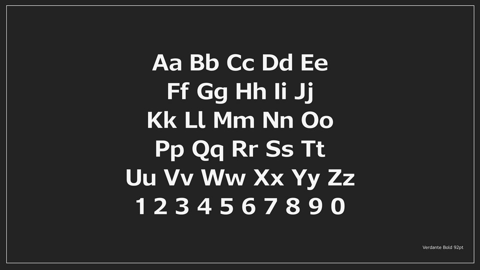
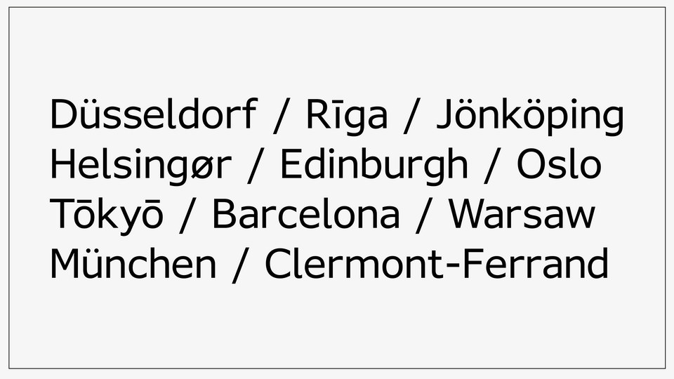
Verdante is a modern typeface inspired by Verdana, a popular typeface that has gained a lasting place in the design world. It preserves the organic, humanist characteristics of its predecessor while improving the less appealing elements. It features a large x-height, open counters, and loose spacing which makes it legible even in small sizes and on low resolution computer screens. The well-rounded letterforms are designed for improved readability and aesthetics, offering an alternative to Verdana. Verdante is a fresh take on a timeless classic, offering a more refined look that still provides the same level of accessibility.
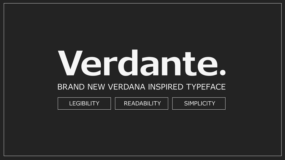
Introducing Verdante - a brand new Verdana inspired typeface.
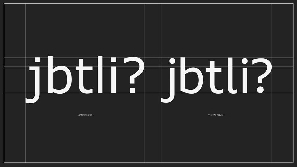
Verdana might not be the most aesthetic typeface, but its organic, humanist characteristics like its large x-height, open counters and loose spacing make it readable in small sizes on low resolution computer screens.
It has survived through the decades and gained its place in the hall of fame of accesible typefaces. But it is also one people love to hate.
Verdante is a refresh of its predecessor - keeping all the good bits, but also addressing some of the less appealing elements.
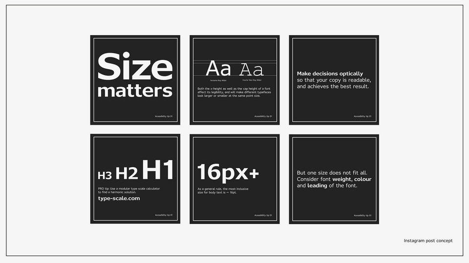
Design considerations were based on research projects and publications by Royal Danish Academy – Architecture, Design, Conservation.
To encourage good practice around accessibility, the typeface would be distributed free of charge with an accompanying digital handbook.
To further inform and engage with designers and typography enthusiasts, an Instagram profile would be created featuring valuable educational posts.
https://www.behance.net/pavils
)
)
)
)
)
)
)
)
)
)
)