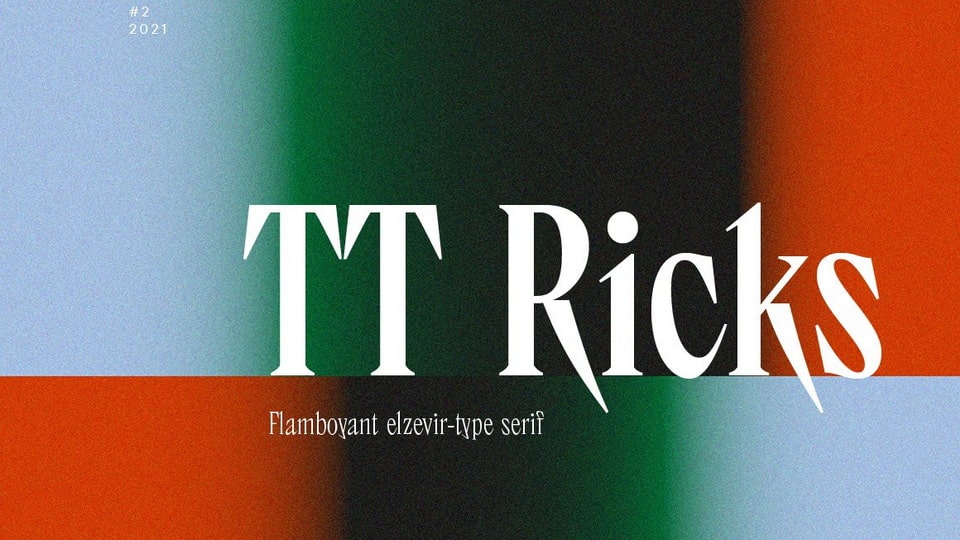
TT Ricks is a bold and vivacious elzevir-type serif that exudes personality and energy. This eye-catching display title typeface is ideal for large and medium sizes in a range of design applications such as packaging, books, and posters.
Inspired by the pre-digital font "De Vinne", TT Ricks pays homage to its historical prototype while simultaneously forging a new identity with unique and lively details.
One of the standout features of TT Ricks is its striking contrast, sharp serifs, and narrow letterforms that boast a pronounced displacement of flows in the arches. The typeface's dense spacing and bold style give it a Gothic-like richness and tension.
TT Ricks also features dashing shapes of ascenders and descenders, thin and sharp stroke endings, and the distinct "elzevier legs" of the letters R K k. In the lowercase characters c e s, the oval shape is noticeably slanted, adding an element of surprise and contrast to the font. Similarly, the ascenders and descenders of the letters f and y are designed to break up monotony and delight the reader's eyes.
In summary, TT Ricks is a playful and energetic typeface that is perfect for designers looking to add a touch of liveliness and personality to their projects.


)
)
)
)
)
)
)
)
)
)
)