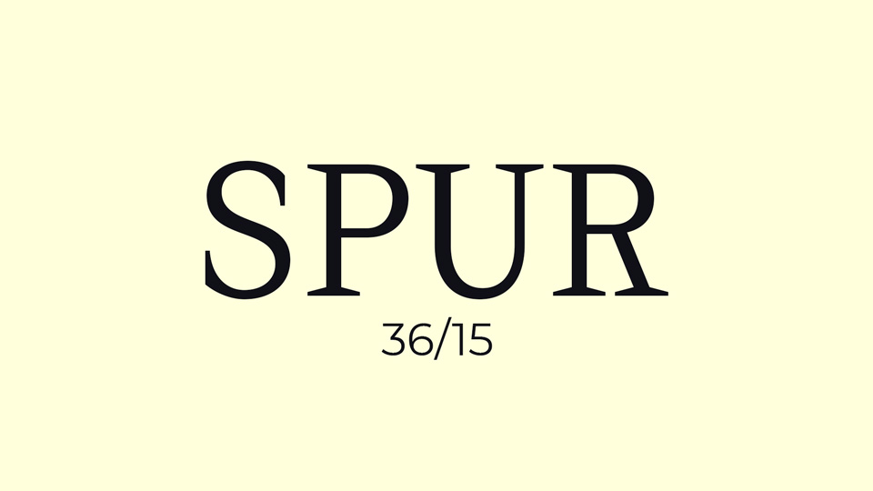
The typeface Spur is one that is sure to grab attention. Its dagger-like serifs are sharp and pointed, making it a unique and eye-catching font. Despite its potential attractiveness, Spur must be admired from a distance. Its spiky serifs hint at danger, and its simplicity and strength suggest that it should be used sparingly. Spur is best suited for titles and subtitles, where it can be appreciated for its edgy look and strong presence, but not interacted with. The typeface Spur is one that should be looked upon with admiration, but not used in any way that might bring harm.


)
)
)
)
)
)
)
)
)
)
','https://myfontlib.com/fontswebsite/image/serif/202302/londonfreefont.jpg'))