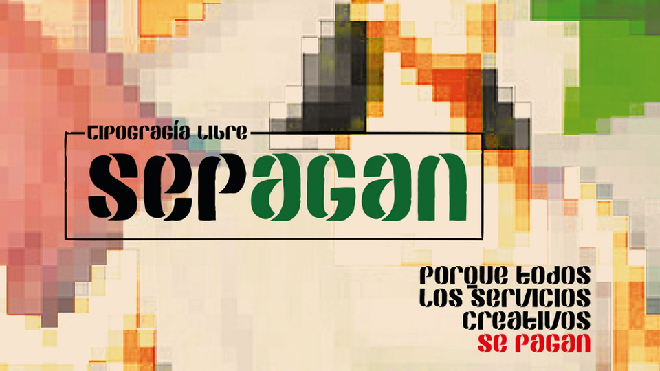
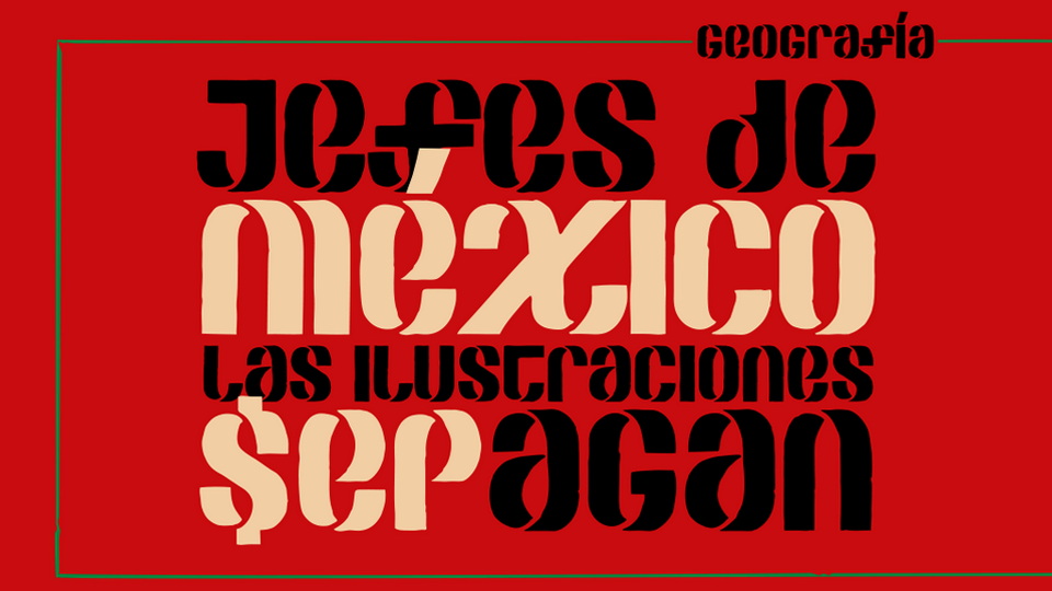
The SEPAGAN font was born out of a need to raise awareness within the Mexican creative industry. This was in response to a call from the Ministry of Public Education (SEP) to illustrate free textbooks for the 2021-2022 school year. However, the Ministry proposed to pay collaborators only with a certificate, a printed copy, and author's credit. This move reaffirmed the constant precariousness and low social value suffered by the illustrators' guild and extended to all visual creators.
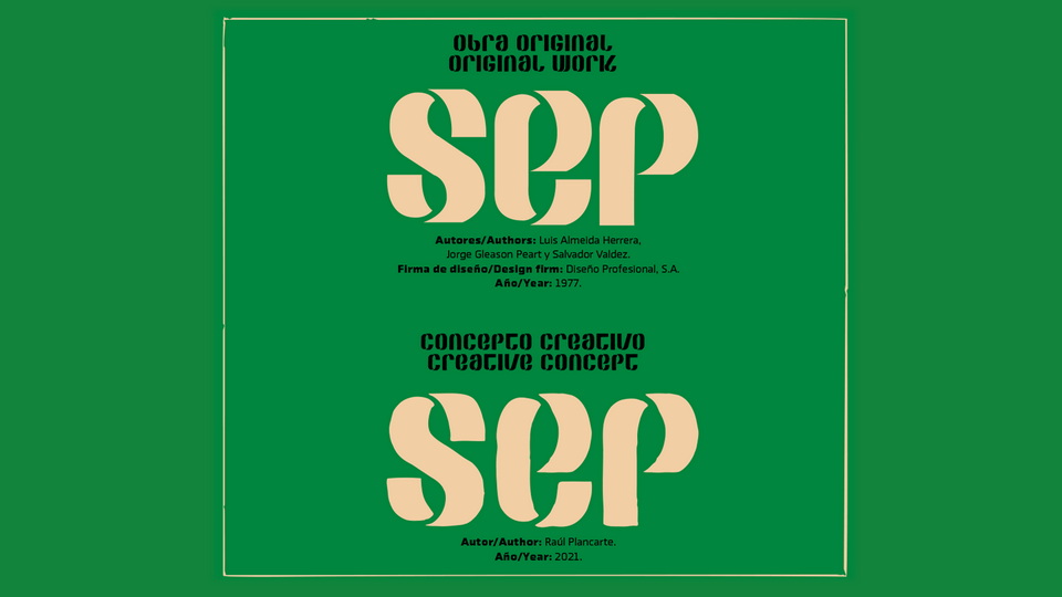
The SEPAGAN font is free to use and inspired by the now-disused SEP logo created in 1977 by Luis Almeida Herrera, Jorge Gleason Peart, and Salvador Valdez. The font's outline metaphorizes the crude and "sloppy" nature of the convocation, an analogy of the tremendous discontent it aroused. The rough finish of the font distances it from the original work and demonstrates the irony of the proposal.
This typeface serves as a reminder that behind every representative of the creative industry, there is money, time, and effort invested in achieving the necessary quality for their specialty. As a government institution responsible for the National Institute of Copyright, the SEP should promote adequate remuneration for demanding work.
Designed by Mexican typographer Raúl Plancarte, the SEPAGAN digital alphabet was born as a form of protest for this cause. It stands as a symbol of resistance against the constant exploitation of visual creators in Mexico.
[Spanish below.]
Thank you for downloading this font!
You can distribute this font without the author’s permission.
You can modify this font to better suit your needs, but you must specify that the your file is different from the original file.
If you have any question, please contact me at
[email protected] OJO: AQUÍ PEGA EL TEXTO TRADUCIDO AL INGLÉS, PARA QUE QUEDE IGUAL QUE LO QUE TE PEGO ABAJO.
———
¡Gracias por descargar esta fuente!
Puedes distribuir esta fuente sin la autorización del autor.
Puedes modificar esta fuente para adaptarla a tus necesidades, pero debes especificar que tu archivo es distinto del archivo original.
Si tienes alguna pregunta, por favor escríbeme a
[email protected]SEPAGAN fue diseñada por la necesidad de generar conciencia en la industria creativa mexicana ante la convocatoria que lanzó la Secretaría de Educación Pública para ilustrar los libros de texto gratuitos del ciclo escolar 2021-2022. A cambio de las aportaciones gráficas, la Secretaría propone retribuir a los colaboradores únicamente con una constancia, un ejemplar impreso y el crédito del autor. Lo anterior reafirma la precarización constante y la poca valoración social que padece el gremio de ilustradores, misma que se extiende en general a todos los creadores visuales.
Esta nueva fuente de uso libre se inspira en el logotipo legendario —y ya en desuso— de la SEP, creado en 1977 por los diseñadores Luis Almeida Herrera, Jorge Gleason Peart y Salvador Valdez, en la firma Diseño Profesional, S.A. Posee un contorno que metaforiza lo burdo y “mal hecho” como analogía del tremendo descontento que la convocatoria suscitó. Asimismo, este acabado rugoso permite guardar distancia con respecto a la obra original y evidenciar la ironía de esta propuesta.
Con esta fuente tipográfica recordamos que detrás de todo representante de la industria creativa hay dinero, tiempo y esfuerzo invertidos en alcanzar la calidad necesaria en su especialidad, por lo que una institución gubernamental tan importante como la SEP —que además es la encargada del Instituto Nacional del Derecho de Autor— debería ser una de las principales promotoras de la retribución adecuada hacia esta labor tan demandante.
Diseñada por el tipógrafo mexicano Raúl Plancarte, el alfabeto digital SEPAGAN nace como una forma de protesta por esta causa.
Mérida, Yucatán, México. Marzo de 2021.


)
)
)
)
)
)
)
)
)
)
)