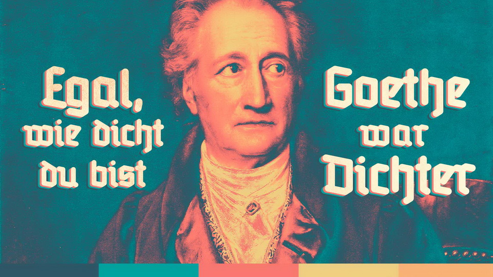
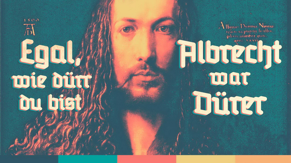
RediFraktur is an innovative and attractive variation of the gothic script that perfectly emulates the broken shape of the fraktur. By using a simulation of a redis pen, the script is given equal thickness to the rounded lines at its ends, allowing for a more modern look that reduces the aggressiveness of the letter’s silhouette, while still maintaining its gothic characteristics. This adaptation was inspired by the Tanneberg cut, which was used until the 1930s in German railway station markings. RediFraktur is an impressive example of modernizing a font while still maintaining its original essence.
Redifraktur BETA
The RediFraktur font is a variation of the gothic script (fraktur), written by using the pen nib (redis). The project is the result of an experiment which aims to create a modern typeface of broken letters.
The traditional gothic alphabet commonly known as gothic is derived from calligraphy and handwriting. Tool that is used to create decorative silhouette giving letters broken arches is a reed stick. Over the years its character has been preserved in printing fonts, moulding its unique structure (Latin frangere - break). Despite the limited readability of the typeface it was widespread in German-speaking and Nordic countries until the middle of the twentieth century. This resulted in Germans perceived it, as their own national German alphabet style. It is also mistakenly linked with Nazism, meanwhile the Nazis themselves associated the letter structure with a Jewish lettering (sic!) and in 1941 ordered replacing it with an antique style. After the Second World War, its importance diminished and it is used only as an ornamental and historical typeface.
The RediFraktur imitates the broken shape of the fraktur using a simulation of a redis pen that gives equal thickness to the rounded lines at its ends. This gives a more modern look and reduces the aggressiveness of the letter's silhouette while maintaining the characteristics of Gothic. It was inspired by the Tanneberg cut that was used until the end of the 1930s in the German railway station markings.
The BETA version contains all the characters of the German alphabet, digits and some punctuation marks in the bold variety. In the course of further work it is planned to extend the family with regular and semibold varieties, complementing the ligatures and special characters.
Design: Jakub Stanski
www.stanski.eu
License: 100% Free
http://stanski.eu

)
)
)
)
)
)
)
)
)
)
)