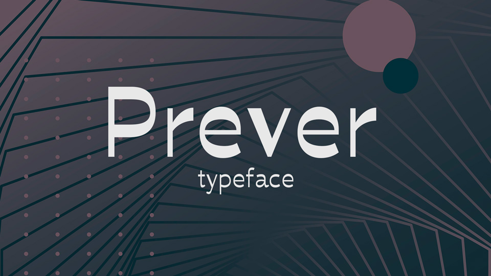
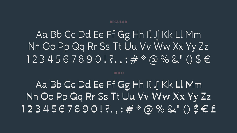
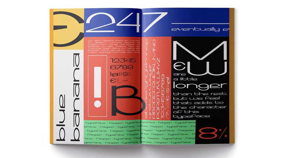
BP Prever is an innovative reversed-stress experimental typeface that is available in two distinct weights: regular and bold. Both weights are highly suitable for use in very small text sizes, while the bold weight is an excellent choice for display applications. What makes BP Prever so unique is that the two weights share almost identical spacing, as the typeface was designed with reversed stress. This allows for more flexibility when creating designs, as the same spacing can be used for both the regular and bold weights, making it easier to create consistent designs.
The reversed-stress of BP Prever also makes it a great choice for those who are looking for a typeface that gives the illusion of a lighter weight when used at larger sizes. By utilizing the reversed stress, the typeface appears to be lighter than it actually is, which makes it ideal for applications in which a lighter, more delicate look is desired.
Overall, BP Prever is an excellent typeface for both small text sizes and display applications. It is a great choice for those who need a typeface that can be used for both regular and bold weights, and its reversed-stress design makes it an ideal choice for designers who want to create lightweight yet impactful designs.
)
)
)
)
)
)
)
)
)
)
)