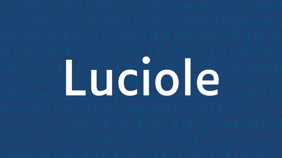
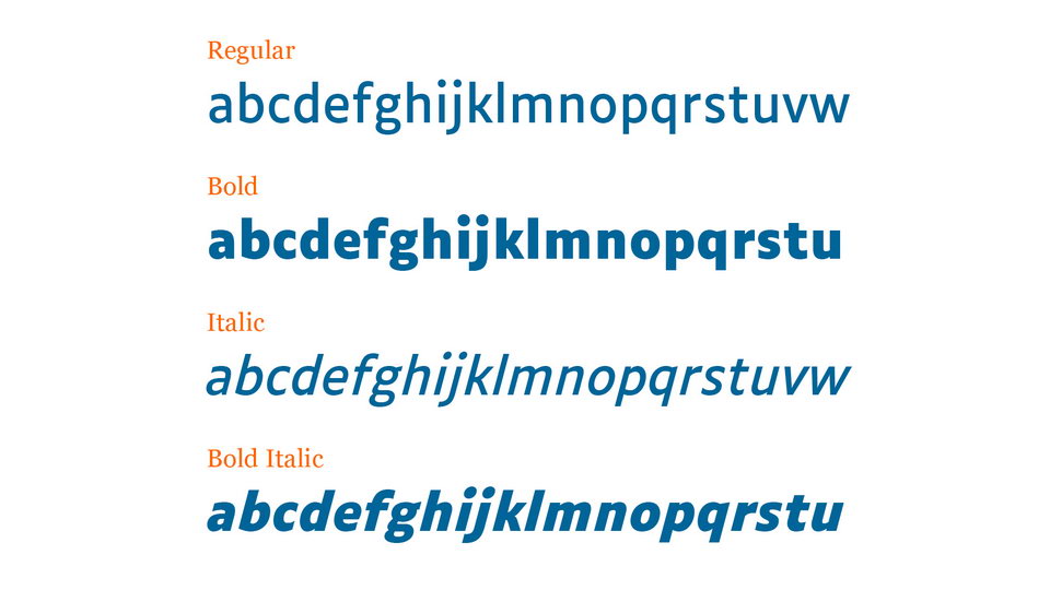
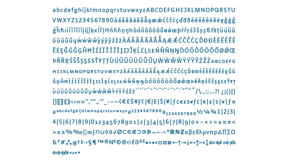
The Luciole typeface is designed with visual impairment in mind, taking into account a dozen specific design criteria to provide the most effective reading experience possible. The typeface is comprised of four distinct fonts: Regular, Bold weights, and matched Italics. Each style contains more than seven hundred characters, and is designed to support almost all European languages.
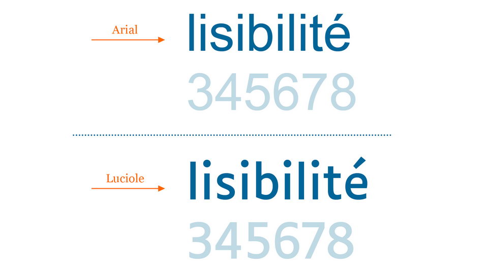
Luciole is not only designed with the visually impaired in mind, but also with publishing professionals in mind. By considering both optimal readability and efficient deployment, Luciole provides a comprehensive solution for both groups. Its design allows for the font to be used in a wide range of contexts, from textbooks, to documents, to webpages.
Ultimately, Luciole is a typeface that is designed to meet the needs of both the visually impaired and publishing professionals. Its combination of readability, efficiency, and versatility make it an ideal solution for both groups. With its various features and customization options, Luciole is sure to be a valuable asset to any visual impairment user or publishing professional.
Luciole is available for download under a Creative Commons Attribution license., which covers use (including commercial use) and distribution of the typeface for free. Simply download the fonts and move the files to the appropriate Fonts folder on your computer.
http://www.luciole-vision.com/luciole-en.html
Ces fontes sont distribuA�es gratuitement sous Licence publique Creative Commons Attribution 4.0 International :
https://creativecommons.org/licenses/by/4.0/legalcode.fr
These fonts are freely available under Creative Commons Attribution 4.0 International Public License:
https://creativecommons.org/licenses/by/4.0/legalcode
Luciole A� Laurent Bourcellier & Jonathan Perez


)
)
)
)
)
)
)
)
)
)
)