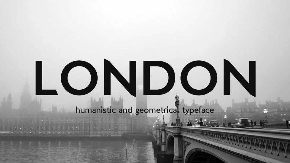
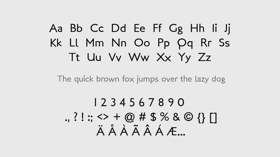
London is a typeface that fuses together the best of both worlds – humanistic and geometrical. It is a sans serif font family with Light, Regular, and Bold weights that provide a complete set of glyphs for multilingual support.
London font is a versatile typeface that can be used for a variety of purposes. It can be used for logos and branding, for headlines and banners, for posters, for social media and more. Its geometric and humanistic qualities make it fit for many applications, from modern and minimalist aesthetics to more traditional ones. Its versatility and compatibility with multiple languages make it a great choice for international projects.
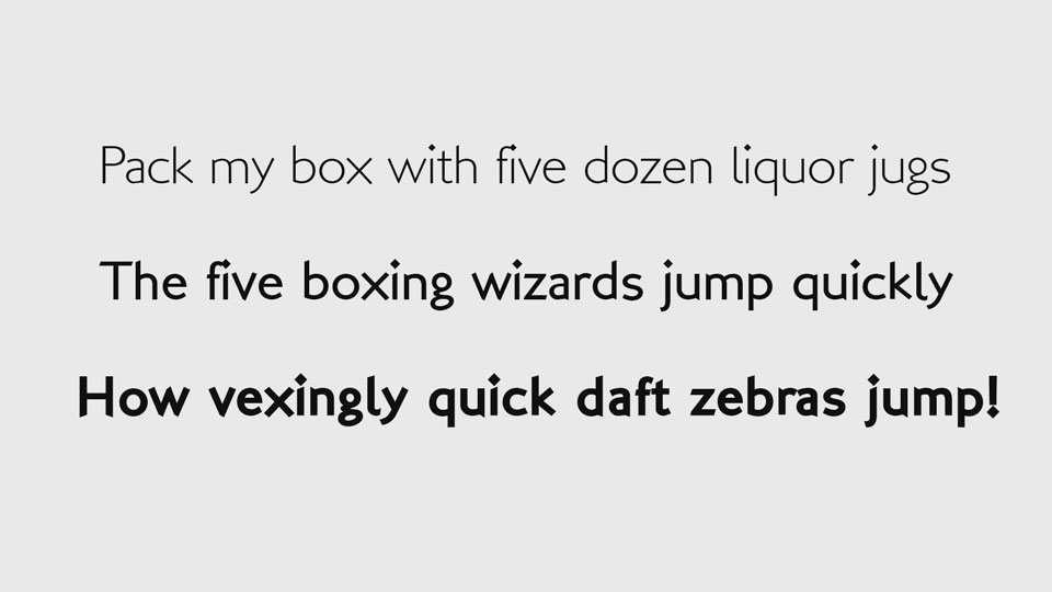
London font is also characterized by its great readability. Its geometrical characteristics make it easy to read even when used in smaller sizes, and its humanistic details ensure that it looks great in larger sizes. Its clean and modern look make it a great choice for digital projects, while its subtle details make it stand out in print.
In conclusion, London font is a great choice for all kinds of projects, from digital to print. Its versatile and modern look, combined with its great readability and multilingual support, make it an ideal choice for anyone looking for a reliable and stylish typeface.
ReadMe (well, if you feel like)
Here are some fonts I made up.
Hope you like them, and if you happenned to use it I'd be just pleased with it.
Also I appreciate any feedback, any critics, don't be too rude is all...
For those really curious, here is what I had in mind creating these fonts.
SoleaMM was my first attempt to make a complete font, and I as feared the process to be too simple I decided to start it MultipleMaster. Good trick, it was NOT too simple. The starting idea was to catch the simplicity and modern/antique feeling of some Roman grafitti (maybe from Pompei) I once saw in a book. This kind of starting idea usually lead to a result with a completely different feeling, which is the case here. Though, I like the font, especialy for big short headlines, used wide-spaced.
Brouss is a quick'n'dirty'n'happy brush work.
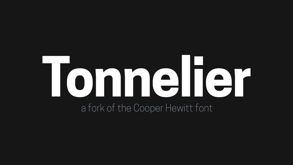
LondonMM tries to be both humanistic and geometrical, and probably fails in both. It should be usable, though, at least if I was better at fine-tuning the kernings...
LambadaDexter is the only font I ever get paid to design! So I can claim to be a pro! Gee!
If you find it cartoony, no wonder, it was for a french cartoon network.
Fonitek is intended for kidsbooks, but if you feel like using it for a Wittgenstein reprint, you're the boss.
�fb2001, but use and distribute freely, as long as you don't charge for it.
You can post messages on newsgroup alt.binaries.mac.fonts
You can E-mail me:
[email protected] TO EVERYONE ASKING ABOUT USING THIS FONT FOR COMMERCIAL USE:
Yes, it is OK.
Feel free to show you appreciation by making a small donation to my paypal account (there is a button to that effect under the download button).
But you are in no obligation to do so.
The use of the font is really free.
Truly Yours,
The author, Francois Bruel
)
)
)
)
)
)
)
)
)
)
)