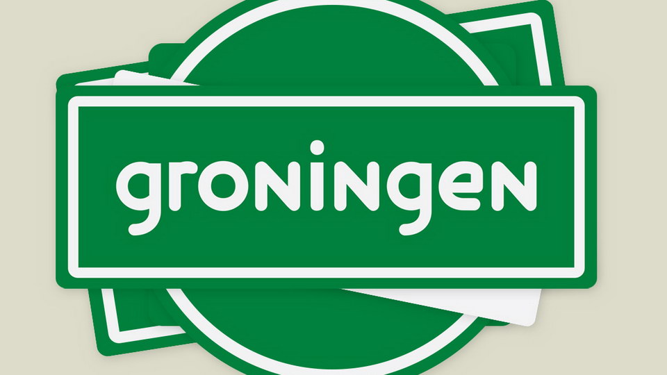
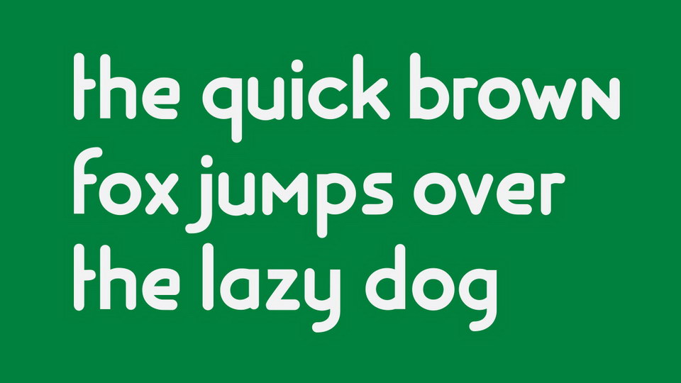
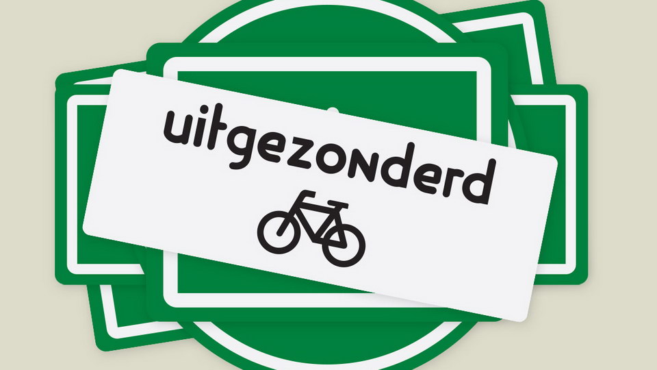
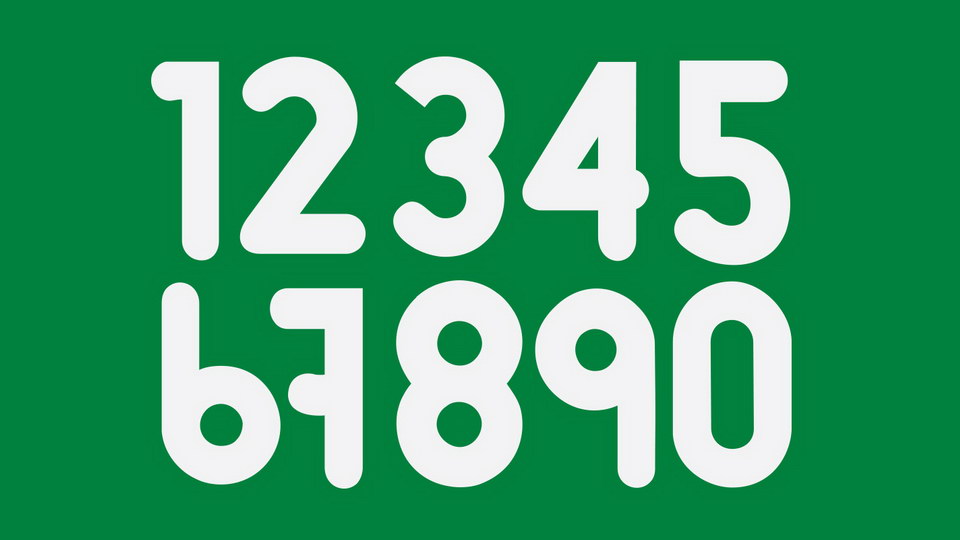
Groningen is a unique typeface inspired by the cycling-friendly city of Groningen. The font is characterized by simple, rounded shapes that capture the essence of the cycling signs seen all around the city. The design of the font reflects the fact that almost everyone in Groningen uses bicycles as a form of transportation. As such, the font contains only lowercase letters and numbers, as if to emphasize the simplicity of the city's cycle-centric infrastructure. The Groningen font is a testament to the city's cycling-friendly approach, and serves as a reminder of the importance of sustainable transportation.
License: Creative Commons - Attribution (CC BY 3.0)
https://www.behance.net/subformdotnet
)
)
)
)
)
)
)
)
)
)
)