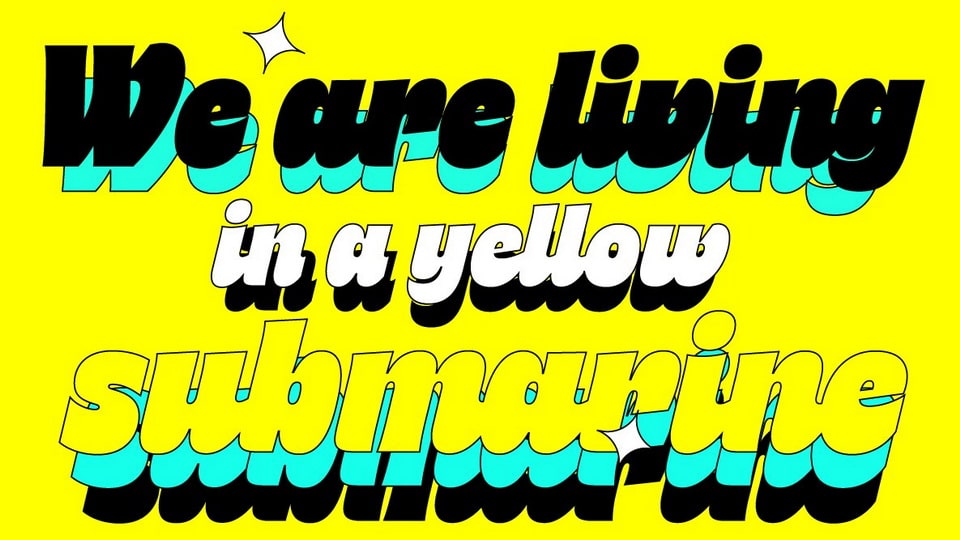
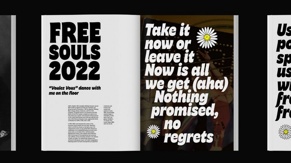
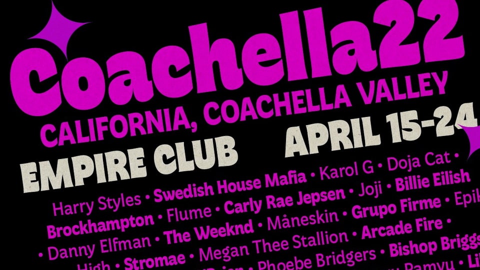
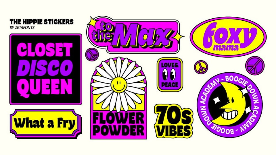
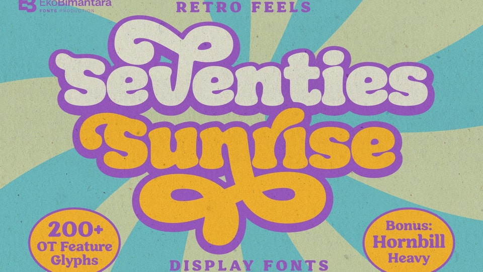
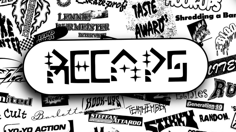
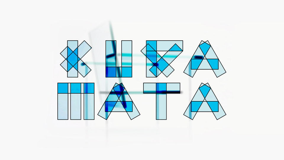
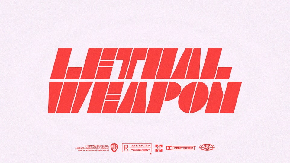
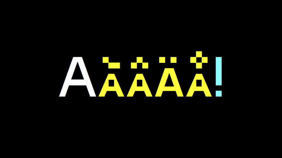
The 1970s saw a surge of vibrant and lively typography, a reaction to the practicality of modern design. Psychedelia and Pop culture spurred a return to the voluptuous shapes of Art Nouveau, and new technology such as photo-lettering and rub-on transfers allowed for typography to become more expressive and less legible. Typographic masterpieces bubbled with geometric extravagance and calligraphic inventions, creating an atmosphere of joy.
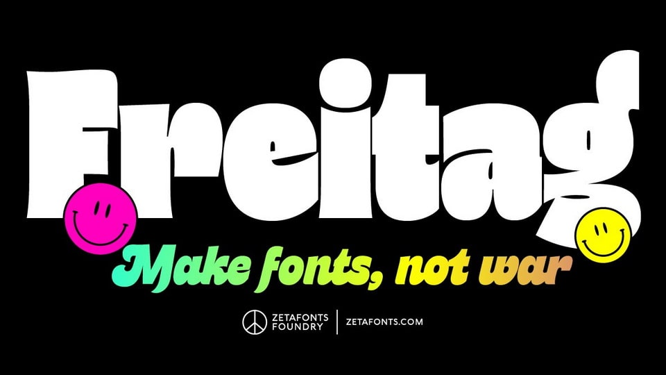
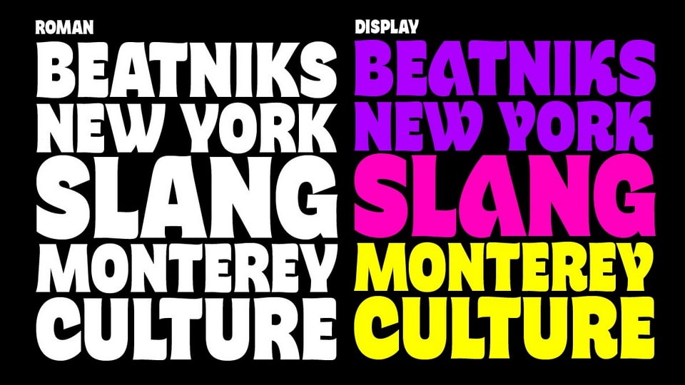
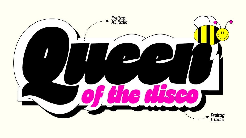
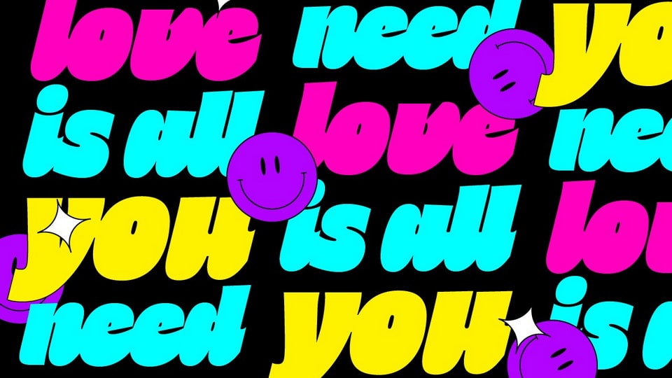
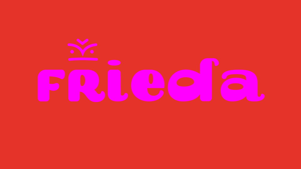
Cosimo Lorenzo Pancini's typeface Freitag is a tribute to this era. Its starting point was the design of a heavy sans serif, with reverse contrast and flared stems. The tension and exuberance builds along the weight axis, with Light and Medium weights featuring a controlled, medium-contrast design, and the Bold and Heavy weights bearing the most extreme contrast. Its display subfamily introduces variant letterforms, swash capitals and cursive letterforms. The full family includes 16 styles and 4 variable fonts, offering an extended Latin character set, case sensitive forms and alternate glyphs.
Freitag is a romanticized homage to the carefree, experimental typography of the 1970s. It is the perfect typeface for logos, ultra-expressive editorial design, and typography that is full of life.
)
)
)
)
)
)
)
)
)
)
)