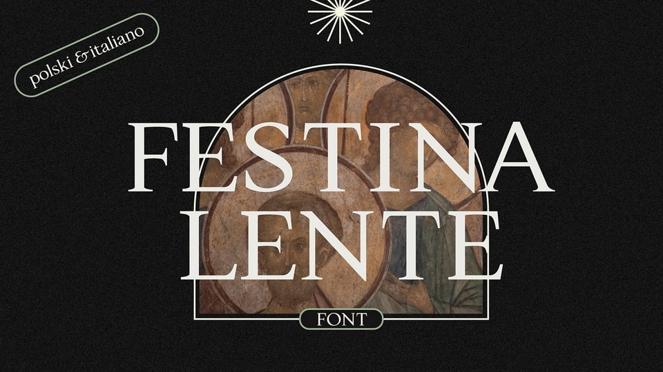
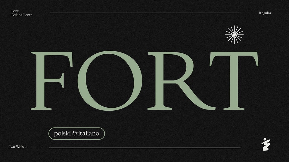
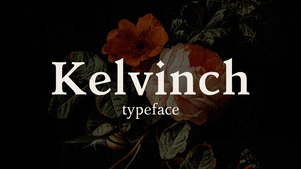
Festina Lente: The Perfect Marriage of Tradition and Modernity
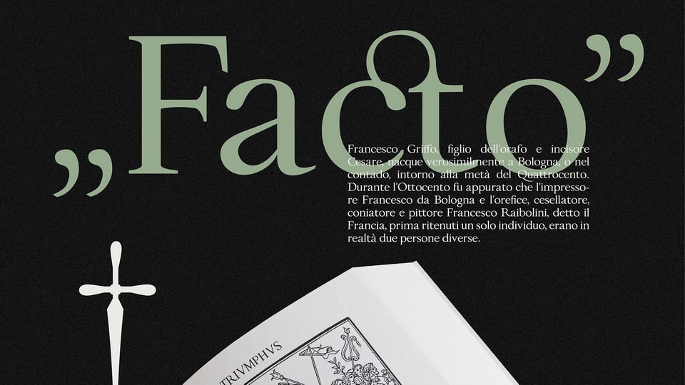
Typeface design is a unique blend of conservatism and progressivism. While it adheres to certain principles, it also evolves with the changes in language. Aldo Manutius' Italian Renaissance prints served as the inspiration for the Festina Lente typeface, which reflects the perfect balance between tradition and modernity.
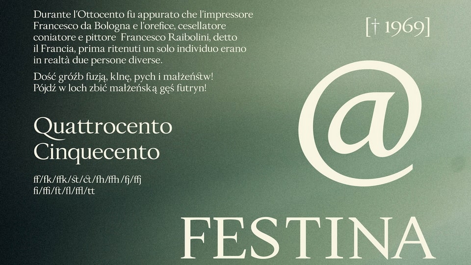
Creating a typeface that includes contemporary characters like W, U, J, and @ posed a significant challenge. However, the designers of Festina Lente were able to overcome this hurdle with their creative ingenuity.
It is essential to acknowledge that the past cannot be viewed through a postmodernist lens. Rather, we must appreciate the beauty and accomplishments of history to improve the present and future. Festina Lente embodies this sentiment by combining the best of the past and present, creating a typeface that is timeless and elegant.
Free for personal and commercial use
https://www.behance.net/iwonawolska


)
)
)
)
)
)
)
)
)
)
)